Framer Tutorials17 June 20252 min read
How to Create Consistent Responsive Typography in Framer Using REM
Learn how to set up scalable, fully responsive typography using rem units and base font sizes in Framer.
Why Typography Needs an Upgrade
If you're still manually setting font sizes for desktop, tablet, and mobile in Framer—48px here, 38px there—you're doing too much. Not only is it time-consuming, but it also creates inconsistencies, especially when you want to make global changes or apply styles to dynamic text components.
Responsive typography in Framer used to be a bit of a mess. Text styles weren’t tied to your breakpoints, and updates were repetitive and error-prone.
But now there's a cleaner way to manage it all: using rem units tied to base font sizes.
What Are rem Units?
In CSS and Framer, 1rem equals the root (base) font size. So if your base size is 16px, then 1rem = 16px, 2rem = 32px, and so on.
When you change the base size, all text using rem units will adjust proportionally. This makes your typography scalable, consistent, and incredibly easy to update.
Step-by-Step: Set Up Responsive Typography with rem
1. Define Base Font Sizes per Breakpoint
Go to your layout template in Framer and define the base font sizes for each breakpoint. A common setup might be:
Desktop: 20pxTablet: 18pxMobile: 16px
You only need to do this once in your template.
2. Use rem in Your Text Styles
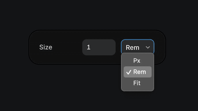
Instead of assigning pixel values like 48px to your H1, use rem units. For example:
H1 → 2.4remBody → 1remCaption → 0.875rem
Now, your text styles will adapt based on the base font size at each breakpoint.
3. Apply a Layout Template to All Pages
To keep everything consistent, use a layout template across your Framer project:
- Go to Assets → Templates
- Create a layout template
- Set your base font sizes for each breakpoint
- Apply this layout to every page
Boom—scalable, responsive typography everywhere.
Why This Is a Game-Changer
- No more adjusting every single text style per breakpoint
- Global updates become instant
- Works with dynamic and animated text (like staggered cycle)
- Cleaner styles, better accessibility, and consistent rhythm
Want your mobile typography slightly larger? Just bump up the mobile base size in the layout. All your styles will update automatically.
This setup is not only efficient—it’s something most design systems wish they had.
Final Thoughts
Once you start using rem + base font sizes, you won’t go back. It's the easiest way to future-proof your typography in Framer.
And if you’re ready to take your design to the next level, **Akila Studio** is here to help. Reach out to us today to see how we can transform your project!
