← All writing
Framer Tutorials29 August 20245 min read
How to Password Protect Individual Pages on Framer
Learn how to password protect any framer page with a simple component.
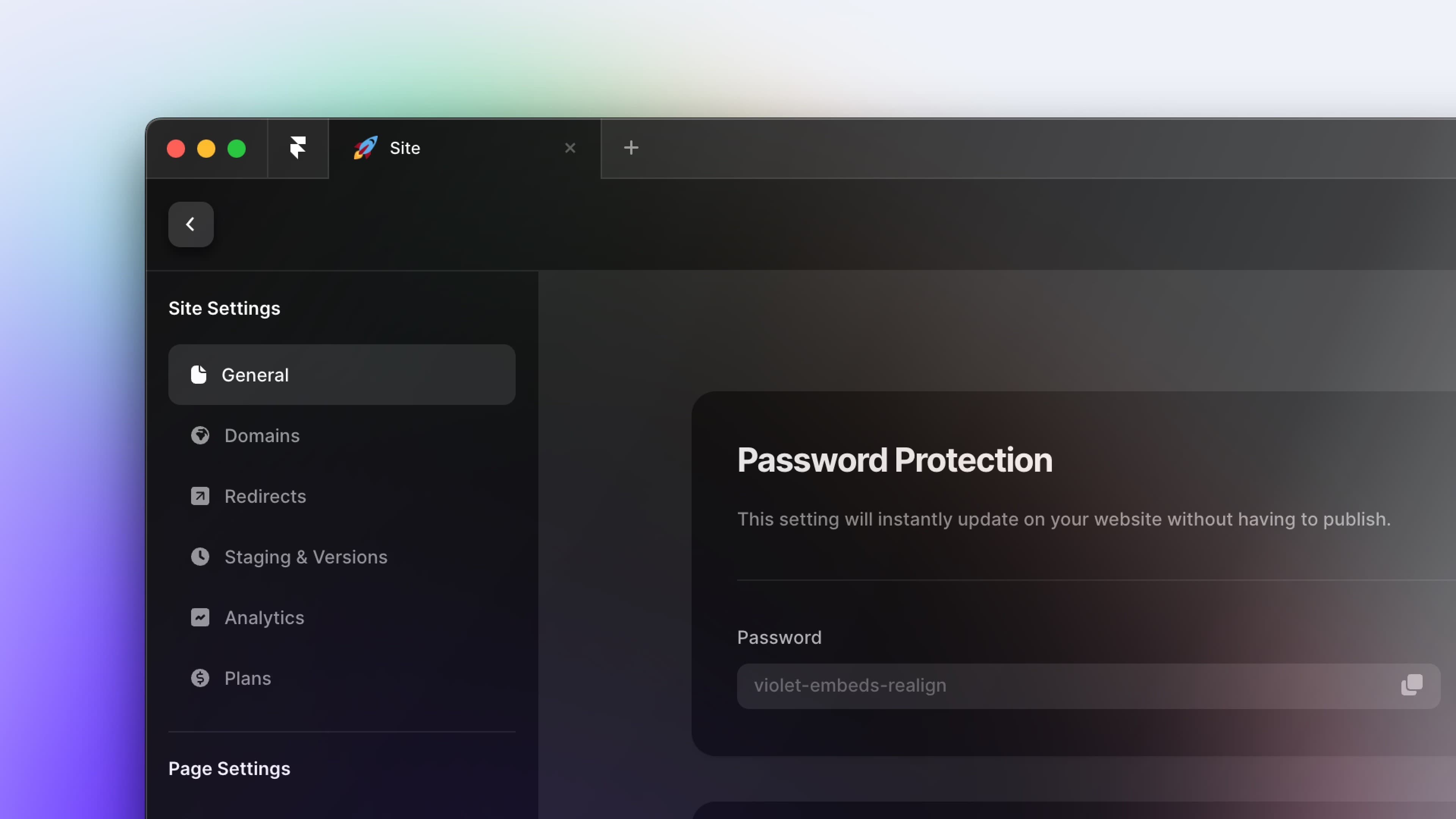
How to Password Protect Individual Pages on Framer
- Add a new code override and give it a name.
- On the left sidebar pane, Go to "Assets" tab
- Click (+) to add a new code file
- Name the code file
Auth.tsx - Select file type as "New Override"
- Click "Create"
- Delete the sample code in the new file
- Copy and paste the provided code into the
Auth.tsxfile.
import React, { useState, useEffect, useRef } from "react"
import type { ComponentType } from "react"
import { addPropertyControls, ControlType } from "framer"
import {
    Eye,
    EyeSlash,
    LockSimple,
    LockSimpleOpen,
    ArrowUUpLeft,
} from "phosphor-react"

// ===== CUSTOMIZATION SECTION =====
// Edit this section to customize the password protection

// Add or remove passwords here (case-sensitive)
const ALLOWED_PASSWORDS = ["ABCD", "abcd", "Abcd"]


// Customize the text content here
const TEXT_CONTENT = {
    title: "PRIVATE CONTENT",
    subtitle: "Enter passcode to continue (passcode: abcd)",
    errorMessage: "Incorrect passcode. Please try again.",
    buttonText: "Unlock",
    returnButtonText: "Return to Projects",
}

// Change this URL to where you want users to return when clicking the link to return
const RETURN_URL = "https://www.google.com"

// Customize the design here
const STYLE_TOKENS = {
    colors: {
        background: "#FFFFFF", // Background Color
        text: "#000000", // Main text color
        primary: "#000000", // Color for buttons and important elements
        secondaryText: "#605D64", // Color for less important text
        buttonText: "#FFFFFF", // Color for the button text
        error: "#D8512A", // Color for error messages and error input border
        inputBorder: "#CCCCCC", // Default border color for input fields
        inputBorderFocus: "#000000", // Border color when input is focused
        inputBorderError: "#D8512A", // Border color when there's an error
        buttonHover: "#333333", // Button color on hover
        linkHover: "#333333", // Home link color on hover
    },
    fonts: {
        heading: "Syncopate, sans-serif", // Font for headings
        body: "General Sans, sans-serif", // Font for body text
        button: "General Sans, sans-serif", // Font for button text
    },
    fontSizes: {
        title: "clamp(1.25rem, 1.586vw + 1.151rem, 2rem)", // Responsive title size
        paragraph: "18px",
        input: "16px",
        button: "16px",
        small: "14px",
    },
    fontWeights: {
        normal: "500",
        medium: "600",
        bold: "800",
    },
    spacing: {
        xs: "4px",
        sm: "8px",
        md: "12px",
        lg: "24px",
        xl: "32px",
        xxl: "48px",
    },
    borderRadius: {
        small: "8px",
    },
    container: {
        maxWidth: "400px",
    },
}
// ===== END OF CUSTOMIZATION SECTION =====

const styles = {
    container: {
        display: "flex",
        flexDirection: "column",
        alignItems: "center",
        justifyContent: "center",
        minHeight: "100vh",
        backgroundColor: STYLE_TOKENS.colors.background,
        fontFamily: STYLE_TOKENS.fonts.body,
        color: STYLE_TOKENS.colors.text,
        padding: STYLE_TOKENS.spacing.md,
    },
    header: {
        marginBottom: STYLE_TOKENS.spacing.lg,
        textAlign: "center",
    },
    title: {
        fontSize: STYLE_TOKENS.fontSizes.title,
        fontWeight: STYLE_TOKENS.fontWeights.bold,
        fontFamily: STYLE_TOKENS.fonts.heading,
        lineHeight: "125%",
        marginBottom: STYLE_TOKENS.spacing.xs,
    },
    subtitle: {
        fontFamily: STYLE_TOKENS.fonts.body,
        fontWeight: STYLE_TOKENS.fontWeights.normal,
        fontSize: STYLE_TOKENS.fontSizes.paragraph,
        lineHeight: "150%",
        margin: "0px",
        color: STYLE_TOKENS.colors.secondaryText,
    },
    form: {
        width: "100%",
        maxWidth: STYLE_TOKENS.container.maxWidth,
    },
    inputContainer: {
        position: "relative",
    },
    input: {
        width: "100%",
        fontFamily: STYLE_TOKENS.fonts.body,
        fontSize: STYLE_TOKENS.fontSizes.paragraph,
        fontWeight: STYLE_TOKENS.fontWeights.normal,
        paddingTop: STYLE_TOKENS.spacing.md,
        paddingBottom: STYLE_TOKENS.spacing.md,
        paddingLeft: STYLE_TOKENS.spacing.md,
        paddingRight: STYLE_TOKENS.spacing.xxl,
        fontSize: STYLE_TOKENS.fontSizes.input,
        border: `1px solid ${STYLE_TOKENS.colors.inputBorder}`,
        borderRadius: STYLE_TOKENS.borderRadius.small,
        outline: "none",
        transition: "border-color 0.3s",
        WebkitAppearance: "none",
        MozAppearance: "none",
        appearance: "none",
    },
    inputError: {
        borderColor: STYLE_TOKENS.colors.inputBorderError,
    },
    showPasswordButton: {
        position: "absolute",
        right: STYLE_TOKENS.spacing.md,
        top: "50%",
        transform: "translateY(-50%)",
        background: "none",
        border: "none",
        cursor: "pointer",
        padding: "0",
    },
    button: {
        width: "100%",
        padding: STYLE_TOKENS.spacing.md,
        marginTop: STYLE_TOKENS.spacing.lg,
        fontFamily: STYLE_TOKENS.fonts.button,
        fontSize: STYLE_TOKENS.fontSizes.button,
        fontWeight: STYLE_TOKENS.fontWeights.medium,
        color: STYLE_TOKENS.colors.buttonText,
        backgroundColor: STYLE_TOKENS.colors.primary,
        border: "none",
        borderRadius: STYLE_TOKENS.borderRadius.small,
        cursor: "pointer",
        transition: "background-color 0.3s",
        display: "flex",
        alignItems: "center",
        justifyContent: "center",
    },
    buttonHovered: {
        backgroundColor: STYLE_TOKENS.colors.buttonHover,
    },
    error: {
        color: STYLE_TOKENS.colors.error,
        marginTop: STYLE_TOKENS.spacing.md,
        fontSize: STYLE_TOKENS.fontSizes.small,
    },
    returnLink: {
        marginTop: STYLE_TOKENS.spacing.xxl,
        color: STYLE_TOKENS.colors.text,
        textDecoration: "none",
        fontSize: STYLE_TOKENS.fontSizes.small,
        display: "flex",
        alignItems: "center",
    },
    returnLinkHovered: {
        color: STYLE_TOKENS.colors.linkHover,
    },
}

export function requireAuth(Component): ComponentType {
    return (props) => {
        const [authenticated, setAuthenticated] = useState(false)
        const [showPassword, setShowPassword] = useState(false)
        const [errorMessage, setErrorMessage] = useState("")
        const passwordRef = useRef(null)
        const [loading, setLoading] = useState(true)
        const [hovered, setHovered] = useState(false)

        const validateAuth = (e) => {
            e.preventDefault() // Prevent default form submission behavior
            const inputPassword = e.target.elements.password.value

            if (ALLOWED_PASSWORDS.includes(inputPassword)) {
                setAuthenticated(true) // Set authenticated state to true
                setErrorMessage("") // Clear any existing error message
            } else {
                setAuthenticated(false) // Ensure authenticated state is false
                setErrorMessage(TEXT_CONTENT.errorMessage) // Set error message for invalid password
            }

            // Optionally clear the password field after submission
            e.target.elements.password.value = ""
        }

        useEffect(() => {
            if (passwordRef.current) {
                passwordRef.current.focus()
            }
            setTimeout(() => setLoading(false), 1000)
        }, [])

        if (!authenticated) {
            return (
                <div style={styles.container}>
                    <div style={styles.header}>
                        <h1 style={styles.title}>{TEXT_CONTENT.title}</h1>
                        <p style={styles.subtitle}>{TEXT_CONTENT.subtitle}</p>
                    </div>
                    <form onSubmit={validateAuth} style={styles.form}>
                        <div style={styles.inputContainer}>
                            <input
                                type={showPassword ? "text" : "password"}
                                name="password"
                                ref={passwordRef}
                                style={{
                                    ...styles.input,
                                    ...(errorMessage ? styles.inputError : {}),
                                }}
                                onFocus={(e) =>
                                    (e.target.style.borderColor =
                                        STYLE_TOKENS.colors.inputBorderFocus)
                                }
                                onBlur={(e) =>
                                    (e.target.style.borderColor = errorMessage
                                        ? STYLE_TOKENS.colors.inputBorderError
                                        : STYLE_TOKENS.colors.inputBorder)
                                }
                                autoComplete="new-password"
                            />
                            <button
                                type="button"
                                onClick={() => setShowPassword(!showPassword)}
                                style={styles.showPasswordButton}
                            >
                                {showPassword ? (
                                    <EyeSlash
                                        size={20}
                                        color={
                                            STYLE_TOKENS.colors.secondaryText
                                        }
                                    />
                                ) : (
                                    <Eye
                                        size={20}
                                        color={
                                            STYLE_TOKENS.colors.secondaryText
                                        }
                                    />
                                )}
                            </button>
                        </div>
                        {errorMessage && (
                            <p style={styles.error}>{errorMessage}</p>
                        )}
                        <button
                            type="submit"
                            style={{
                                ...styles.button,
                                ...(hovered ? styles.buttonHovered : {}),
                            }}
                            onMouseEnter={() => setHovered(true)}
                            onMouseLeave={() => setHovered(false)}
                        >
                            {hovered ? (
                                <LockSimpleOpen size={20} />
                            ) : (
                                <LockSimple size={20} />
                            )}
                            <span
                                style={{
                                    marginLeft: STYLE_TOKENS.spacing.sm,
                                }}
                            >
                                {TEXT_CONTENT.buttonText}
                            </span>
                        </button>
                    </form>
                    <a
                        href={RETURN_URL}
                        style={styles.returnLink}
                        onMouseEnter={(e) =>
                            (e.currentTarget.style.color =
                                STYLE_TOKENS.colors.linkHover)
                        }
                        onMouseOut={(e) =>
                            (e.currentTarget.style.color =
                                STYLE_TOKENS.colors.text)
                        }
                    >
                        <ArrowUUpLeft
                            size={16}
                            style={{ marginRight: STYLE_TOKENS.spacing.sm }}
                        />
                        {TEXT_CONTENT.returnButtonText}
                    </a>
                </div>
            )
        }

        return <Component {...props} />
    }
}

// Add property controls (if needed)
addPropertyControls(requireAuth, {
    // Add your property controls here
})- Personalize the design and copy
Change the values of the design tokens: ALLOWED_PASSWORDS, TEXT_CONTENT, RETURN_URL, STYLE_TOKENS to fit your brand.
- Save code override file
Press CMD + S on Mac or CTRL + S on Windows to save
Extra
You can set multiple passwords that will work across all pages using this code override. Simply edit the ALLOWED_PASSWORDS list. For example:
const ALLOWED_PASSWORDS = ["myPassword123", "letMeIn", "secretCode"]Note: If you want different passwords for separate pages, you'll need to duplicate the "Auth.tsx" file, change the passwords in each copy, and apply the appropriate code override to each page.
